This weeks Top Ten Tuesday topic hosted by Broke and Bookish is Top Ten Book Cover Trends I like/dislike. I am going to do a few of each starting with the ones i dislike, but i couldn’t come up with enough of each ones. As most of you know there are so many issues we all have with book covers and I am sure most of these many people will agree with.
Cover Trends I Dislike:
♠ GIRLS IN DRESSES.
♠ BOY/GIRL KISSING (and stuff) MODELS
♠ HALF FACES
Cover Trends I Like:
♠ BIG FONT/ PRETTY TYPOGRAPHY
♠ HAND DRAWINGS/WATER COLORED
♠ JUST WORDS (no people)
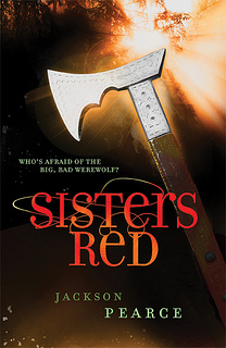
♠ WEAPONS
What are some of your favorite and least favorite cover trends?


13 comments
We have some likes and dislikes in common. 🙂 I listed where you only see the bottom half of their face, or the head is completely off the cover, which is just a different half-face cover.
I personally adore the cover for Rebel Belle, it gives off this strong feministic undertone. 🙂
You see the half-faces a lot these days, it is really annoying. lol Great list!
I love all of your listies!! It’s like you took these straight from my brain. I had big dresses and kissing as two of my dislikes as well 😀
Your lists are so close to mine! I had a bunch of the same likes and dislikes, but some of them were switched. It’s interesting to see how different people look for different things in covers.
I know I have been going through a bunch of peoples lists and love seeing the similarities and differences and then the ones I never thought of.
Great list 🙂
Thank you 🙂
Oooo some excellent choices!
Typography is one of the main things I look for in a cover, which is why I loove how Love Letters to the Dead looks. I’m not a fan of the girls in dresses trend either, unless it’s in the background and not the main focus.
I love the cover of Love Letters to the Dead. I basically will buy any book with that font on it 🙂
I love the huge words on cover trend, too. It just makes the whole cover look so elegant! However, I actually like girls-in-dresses, if it’s done right, also if the girls in the book actually wear dresses at some occasion.
Oh wow, I didn’t think of Abercrombie’s Half a King to be a weapon until now (literally thought it was a misshapen snowflake of some sort…) But now I need to know the meaning of such a weapon considering the amount of feels I got when GRRM’s A Game of Thrones was a simple sword as well!
Cheers,
joey via. thoughts and afterthoughts
I didn’t notice it at first until after I saw the mock cover for the next book and after I read it I realized as well that it was a weapon.